Summary
Part one of an evaluation on a new and innovative product called Entaggle. This post will evaluate the usability and UX (User Experience) of its main focal points: It’s landing screen and public user profiles.
Part two, which will follow shortly will look at typical actions and flows a user might want to take throughout the application. I’ll highlight more flaws and provide suggestions to overcome these. We will also look at ways to test our improvements cost effectively.
Part three, which will be the final part in this series of posts will look at the business model behind Entaggle, providing suggestions for improvement. I’ll finish this post with my conclusions on Entaggle.
A crazy new idea!
The latest craze sweeping the testing community is Entaggle. Some of you may have heard of this already, some might not, but basically it’s a peer recognition web site that allows you to tag someone with a tag that you think they deserve. For example someone that educates other testers might deserve the tag “Testing mentor”, should I think that they are worthy of this I can tag them with it.
Elisabeth Hendrickson of Quality Tree Software appears to be the driving force behind this innovative product with some early contributions also provided by Dale Emery. They appear to have taken the approach of deploying with the most basic functionality possible and building it up via previously scoped requirements and user requests whilst introducing new functionality rapidly via a continuous deployment approach.
A unique opportunity
So why am I writing about Entaggle? Why does it interest me? It’s quite simple really, the product is based upon an innovative idea, it’s new and they plan to eventually make money from it. That there is simply a testers dream!
So I’m going to evaluate the product and feedback on my thoughts in terms of usability, UX (User Experience) and its business model over a series of short blog posts, starting with this, part one.
Getting to grips with Entaggle
When you access the site you’re greeted with a vibrant and simplistic UI. The process of registering an account, finding people, and tagging others is pretty straight forward. This is mainly due to two reasons:
- The product is relatively small; there is not much you can do.
- The user base being a new product is very low (just over 200 members at the time of writing) so finding people and tags is still fairly easy.
Home page
The home page view breaks down into three main areas:
- The top pane, which consists of a site logo, slogan and some quick statistics around users, tags and taggings.
- The main column contains a list of the twenty most recent events, which currently displays new taggings and new members.
- The side column contains various tasks such as user and tag lists, login and logout functions. This is context sensitive so if you’d selected a users profile, a list of tags you can apply to them would appear, directly replacing the previous tasks.
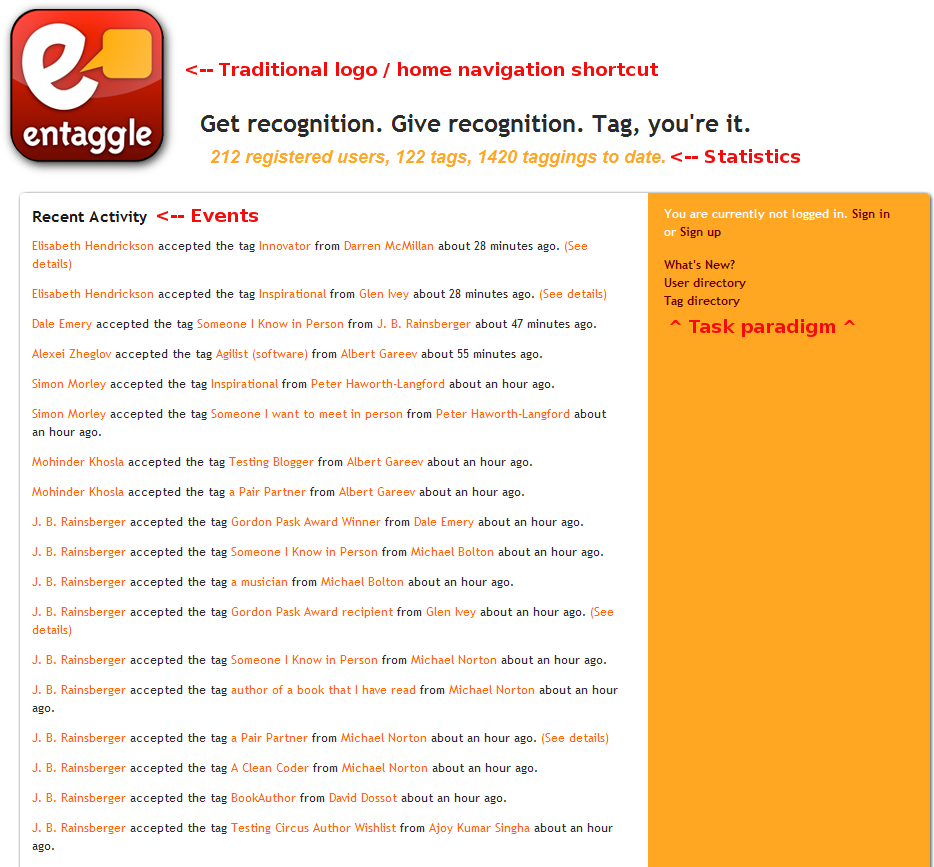
View of the Entaggle home page.
Currently the UI fulfils its purpose, although not the prettiest and very list driven it does present information easily.
Initial concerns
As the current community consists mainly of testers and developers, the information presented is relevant and interesting. When we begin to consider different types of users such a lawyers, doctors or even your local supermarket worker suddenly the information presented here is of less importance and relevance to us.
Events
Certainly from a UX point of view this is one of the initial problems presented with this screen, in that it’s not focused on the current logged in user and what might be of interest to them. Of course the product doesn’t fit well to this line of thought currently, but as user profiles expand, much more context sensitive information can be gathered such as the type of industry they are affiliated with, the company they work for, their interests. This would allow a more context sensitive view of information which would enhance the users experience, rather than them being presented with an event lists which they would train themselves to ignore.
Another idea which would reduce the need for profile expansion would be a watch list. You could add users, tags, or tag categories (we’ll get to that in another post). By default the user would see everything, but they would have the option to configure a watch list to filter out events which are of no interest to them. After all they merely want to cyber stalk here!
There are a few other minor problems with the events list. For one it’s static and requires a page refresh to view new content. It would make sense to dynamically display new events here. This would lead onto another problem, and one which still exists using the manual page refresh method in that how would you know at first glance which events are new or not? Twitter has a nice way of dealing with this problem in that they provide a clickable graphic which displays how many new tweets you have. Lastly you can’t see older events past the current twenty latest events list. Seeing older events might not be a problem if we had content filter in place such as the suggested watch list or profile based context filtering.
Certainly for now with the small mainly testing focused community we don’t have a problem. In a few weeks time though we’ll begin to see the worth of this events list being diminished.
Task Paradigm
The right hand column presents a list of tasks the user may wish execute. As I’d mentioned previously this is context sensitive, so if you’d selected a users name and navigated to their profile, these home page tasks would be replaced with a list of tags you could assign to that user.
So why would this be a problem? Well when we break down into usability criteria we begin to look at factors such as learnability, consistency and time to execute a task all of these are being directly negated by this paradigm. Why? Well tasks such as user / tag lists, user profile and login / logout are actions you may want to take at any time. However they are not always made available. Sure this is a small product for now, but as new features develop and we adopt a sense of a premium users feature set, this paradigm will become less learnable, usable and negate the users experience.
Having the main tasks of Entaggle with a blended horizontal logo in a top title bar would serve well for navigation, learnability and consistency. Linkedin and Twitter both make good use of this paradigm and it works well for them. Both sites are easy to navigate and easy to learn.
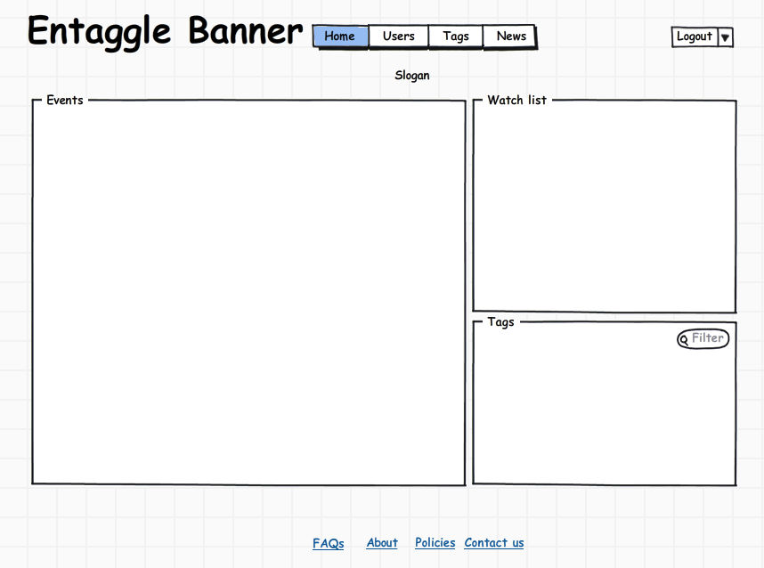
Mockup of how Entaggle could look with a navigation title bar
The above mockup is a quick draft of how the title bar could look, you can see instantly it presents a quick means of navigation for the user. The profile, login and logout tasks have been replace with an option menu with would contain all three.
When you consider that people read from top to bottom, left to right, you can quickly see how the old paradigm of tasks being placed sometimes on the right hand column wasn’t very intuitive. With the top navigation bar it’s immediately apparent how to navigate the site.
Enhancing the users public profile
Now lets move away from the home page, and take a look at another key aspect of Entaggle, the users profile.
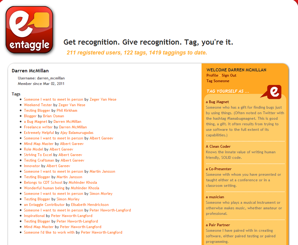
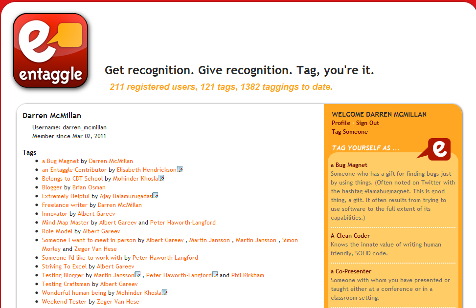
How an Entaggle user profile appears.
As you can see currently we are presented with a list of tags and who has tagged that user sorted by date of tagging with the oldest tag being the first displayed.
Now imagine scaling this up over time, currently I have twenty five tags displayed on this profile. It already looks a little intense, imaging in a few months you’d come back and I had one hundred tags! It would be very difficult to get any grasp of my tag collection in it’s current format. How do you begin to gather a sense of a persons recognition with this many tags?
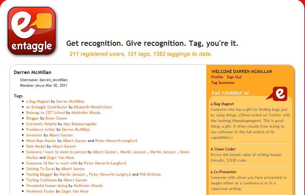
How an Entaggle user profile could look with some slight modifications.
Now look at the above picture. With a couple of minor changes this profile suddenly becomes more usable. All I’ve did is sort the tags alphabetically, and display tags that appear more than once on the one line with the users who have tagged me appearing in a comma separated list.
Immediately it’s more useful, with a simple minor change. Should someone want to view my profile they can quickly gather more relevant information about me, and begin to identify trends.
A modified Entaggle user profile with tag notes.
When someone tags you they get the chance to leave a note about why they have chosen to tag you with that tag. This is a key element of Entaggle and currently we can only ever view the reasoning from the events list on the home page, which we already know is non filterable and capped at the last twenty events. So we are losing out on a key feature and a very relevant piece of information here. By adding the ability to view the reasoning behind a tag to the users profile (as highlighted in the picture above by a notes icon) we enhance the users experience. We also cover a possible future scenario where a recruiter might want to drill into your tags to see what your peers think of you.
If you wanted to work on the social acceptance aspect a little more, and if we are being honest that’s one of the main reasons this concept works, in that people want to be accepted by their peers and thrive on recognition, then we could add in rarity factors.
Private tags can only be assigned by people with the permission to tag you with it. For example I created the private tag “Testing mentor”, currently only myself and a few others can tag people with this. Why not highlight the uniqueness of a private tag visually in the user’s public profile. Likewise the rarity of tags might have some visual indication here as well.
What’s next?
I think that makes for a good place to stop for now. Next we’ll begin to look at process flows and common actions a user might want to take throughout the application, and how UX and usability might be impacted there. We’ll also look at techniques we can use to reduce the cost of enhancing the users experience.
Thanks for reading.
Related posts:
Good write up
I think it is early days but I see this application blowing up to be an exciting application. The site can be improved with minor adjustments to give better user experience. As you said people read top to bottom and from left to right. Having navigation icons at the top and moving the right pane to the left would make sense. Giving a list of tags with check boxes for multiple tagging and dropdown list in the profile section for filtering would make the site more user friendly. Customise colour scheme would be helpful but that is nice to have features. If you switch off the page style you will find it is easy on the eye and all the links are visible so you you do not have to mouse over to find them. The user and tag links in the statistics in the header frame have the same functions as uswe and tag directory and not obvious in due to the page style used.
Hi Mohinder,
Thanks for taking the time out to comment.
Switching the pane to the right could work. Knowing it’s the correct change to make is the greater concern. I’ll talk about techniques you can use to find out if suggest changes make sense in part two of this evaluation.
Cheers,
Darren.
A nice writeup Darren!
Well, I agree with most of your findings about entaggle, but the only thing that would be more interested to see would be how this site will be able to attract more customer base. As FB and Twitter are already there and they will not take them much time to build this functionality, it will be interesting to see how entaggle will be able to cope up with the future market competition.
BTW, great idea implemented by the team Elisabeth Hendrickson and Dale Emery of Quality Tree Software. Congratulations all!
Hi Vipul,
Thanks for the comment.
You’ve jumped ahead of me In the third part of this evaluation we’ll look at among other things the business model and highlight improvements that can be made here.
Cheers,
Darren.
Thanks for your writeup and your suggestions for Entaggle.
FYI, I’m not an employee of Quality Tree Software. I do, however, work with Elisabeth every chance I get.
Also, so far my contributions to Entaggle per se have been small. I paired with Elisabeth to write a tiny bit of the early code. Probably my biggest contribution is enthusiastic tweeting.
I know that some of the UX ideas you mention have already been in the backlog for a few days. Stay tuned, and thanks again for your writing about Entaggle!
Hi Dale,
I’ve updated the post to reflect that you are not an employee of Quality Tree Software and have provided some early contributions.
What lead me to believe this was that you are listed as a member of the company on their about page (http://www.qualitytree.com/company/) and Elisabeth has tagged you as a site contributor on Entaggle. So sorry for the confusion.
It’s good to see that some of these suggestions have already been considered, that’s great!
Cheers,
Darren.